Bill Hester, CFA, CMT
Senior Research Analyst
Hussman Strategic Advisors
January 2026
The point of independence is not to protect policymakers. It just is that every advanced democracy in the world has come around to this common practice. It’s an institutional arrangement that has served the people well – and that is to not have direct elected-official control over the setting of monetary policy. And the reason is that monetary policy can be used through an election cycle to affect the economy in a way that will be politically worthwhile.
– Jerome Powell, January 2026
Central bank independence can sound like an ivory tower debate topic – something economists argue about, far removed from the markets investors navigate every day. But at today’s elevated stock market valuations, it matters more than many realize. When central bank independence weakens, the risks don’t stay theoretical: inflation volatility tends to rise, recession risk can increase, and equity valuations can come under pressure.
As political pressure on the Federal Reserve intensifies and markets ponder the nomination of a new Chair, understanding this chain of risk is increasingly important for investors. Equity valuations are heavily affected by expectations for long-term cash flows, along with the interest rates and risk-premiums that drive how much investors are willing to pay for those future dollars. That means structural risks like potentially diminished Federal Reserve independence deserve close attention, because their effects would be felt over years, not just quarters. As Chair Powell noted in his latest press conference, once confidence in central bank independence is lost, it is extremely difficult to restore.
There is a surprising amount of consensus in the academic literature focused on the importance of central bank independence. Greater independence leads to lower inflation and reduced price volatility. Less independence leads to higher inflation and greater price level variability. These findings are robust whether analyzing U.S. history and the Federal Reserve specifically, or broadening the scope globally to include both developed and developing countries.
Beyond this core relationship, the literature identifies several additional channels through which central bank independence is linked to inflation uncertainty (the expected volatility of inflation), realized inflation volatility, macroeconomic outcomes, and asset prices.
Here are some of the most important ones for investors:
- Political influence increases inflation uncertainty. When monetary policy is subject to political pressure, fiscal dominance (prioritizing debt service over other policy goals), or drifts away from its formal mandate, inflation uncertainty typically rises.
- Real assets outperform nominal assets. Historically, a one–standard deviation increase in a widely used inflation-uncertainty index has been associated with a 23–33% increase in gold and silver prices. During the current episode of elevated inflation uncertainty, these reactions have been far more pronounced: gold has risen 170% and silver 400% over the past two years.
- Financing costs rise. Equity yields and corporate bond spreads tend to increase as inflation uncertainty grows, implying that firms’ borrowing costs rise faster than risk-free rates. To date, these effects have not fully materialized: equity markets remain near all-time highs, and corporate credit spreads are still historically tight.
- The macroeconomic environment tends to deteriorate following periods of high inflation uncertainty. There is a robust and persistent negative relationship between inflation uncertainty and economic performance. As inflation uncertainty increases, so does the risk of recession.
- Uncertainty is about deviation, not just level. Inflation uncertainty does not occur only during periods of high inflation; it can emerge even when inflation runs persistently below target. What matters is not just the level of inflation, but its deviation – both from the central bank’s objective, and from the level that people had assumed when they entered into contracts, mortgages and other commitments.
- Inflation uncertainty is currently high, according to an index developed by the authors of the research paper Inflation Uncertainty: Measurement, Causes, and Consequences, published last summer. Their Composite Inflation Uncertainty Index — built from both market prices and algorithmic analysis of daily news — has reached higher levels only twice in the past 40 years: during the 2008 Financial Crisis and following Russia’s invasion of Ukraine in 2022.
- Volatility and uncertainty move together. Periods of elevated inflation uncertainty are typically accompanied by higher levels of inflation volatility.
Central bank independence matters because attacks on it tend to increase macroeconomic volatility – what I view in terms of variability in both the price level and economic output. This is only one risk among many that could lead to higher macroeconomic volatility. Intermittent tariff policies could continue to pass through to hard-goods prices, as they have over the past year. Commodity markets may experience further spikes followed by sharp corrections, adding to price volatility. The roughly $2.5 trillion in planned data-center investment over the next few years could place continued upward pressure on household electricity costs — or weigh on economic growth if those investments fail to deliver the expected returns. Some of these risks are likely more immediate than a loss of Federal Reserve independence, even if the latter remains an important longer-term concern.
Macroeconomic volatility matters for equity markets because valuation levels tend to be inversely related to both components – inflation and output uncertainty. Consider inflation volatility. Periods of low inflation volatility have generally coincided with higher stock market valuations, while periods of elevated volatility have typically been associated with lower valuations. (In contrast, the level of inflation tends to exhibit an upside-down U-shaped relationship with the level of valuations: very high and very low inflation are usually associated with lower valuations, whereas moderate inflation tends to coincide with higher valuations. In this analysis we’ll mostly rely on the linear relationship of inflation variability with valuations to help describe macroeconomic volatility.)
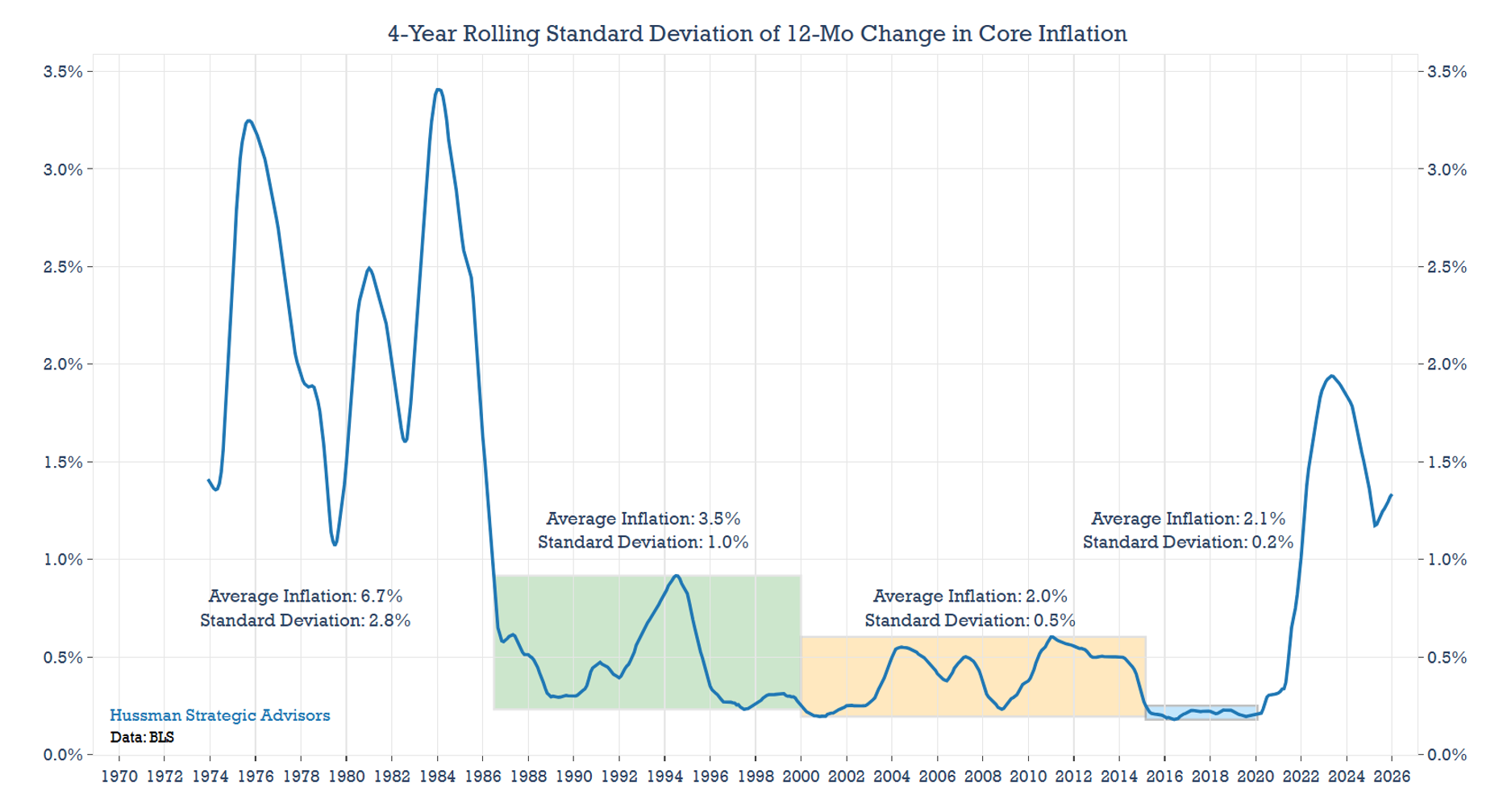
Because the volatility of inflation is less commonly discussed than its level, the chart below shows the standard deviation of price changes over the past 50 years, specifically the four-year rolling standard deviation of year-over-year Core CPI. The chart is annotated to highlight both the average level of inflation and its volatility across different historical periods. Both measures declined steadily over this span until the pandemic.
Even within this long-term downtrend, the period immediately preceding the pandemic stands out. While the 12-month change in core inflation averaged just 2.1% – roughly in line with the prior 15-year average – the more striking feature was the monthly standard deviation of just 0.2%. That’s an exceptionally low level of variability.
To better understand historically associated valuation ranges, we’ll look at several distinct economic environments and highlight the historical median valuation associated with each. In the following charts, the Shiller Cyclically Adjusted P/E (CAPE) Ratio is plotted across different macroeconomic backdrops, including varying levels of inflation volatility, recession frequency, and a composite measure of overall macroeconomic volatility.
For each backdrop, historical data (starting in 1950) is divided into five equal-sized groups, or quintiles. The dotted line in each chart marks the median CAPE ratio for that quintile, while the shaded area represents the middle 50% of the data around the median. The lines above and below the shaded area (called whiskers) represent the remaining 50% of the data.
Valuations do not always conform neatly to these historical patterns. For instance, at the end of 2021 – when inflation was rising at a 7% year-over-year pace – the CAPE ratio reached 40, far exceeding what history would suggest. Outliers like this have occurred in every quintile (and can be seen in the whiskers of each box plot below). Focusing on the central range of outcomes highlights the broader historical record, rather than just the recent extremes. The current CAPE ratio of 41 is also shown in each chart for reference.
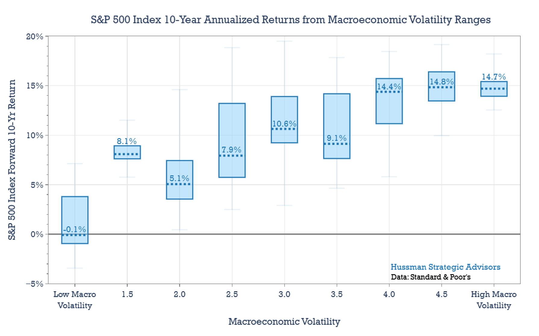
The prospect for future inflation is arguably one of the most important unknowns in markets today. Do investors believe we are returning permanently to the pre-pandemic macroeconomic environment, characterized by low inflation and exceptionally low inflation volatility? Judging by the elevated stock market valuations, it would appear so. But how likely that outcome is, and how much higher inflation volatility may remain in the years ahead, are questions investors will continue to grapple with. The chart below shows the range of stock market valuations typically associated with each quintile of inflation volatility.
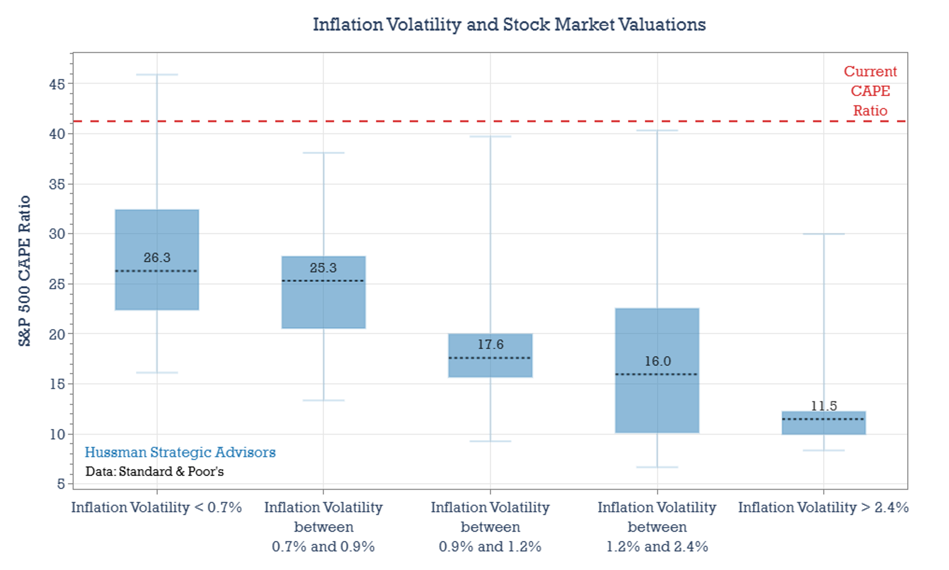
Importantly – and we’ll see this in more detail later – these valuation ranges should not be interpreted as “justified” valuations. Elevated valuations are strongly associated with low subsequent long-term returns. Depressed valuations are strongly associated with high subsequent long-term returns. So, it may be best to think of these “implied” valuation ranges as indications of how comfortable or uncomfortable investors are, which in turn affects how much they are willing to pay for cash flows in the uncertain future, and the expected level of compensation they demand in return for taking risk.
In addition to price volatility, economic volatility can also help explain stock market valuations. Periods of uncertainty concerning economic growth along with elevated recession risk tend to lead to lower stock market valuations. The period between 1965 and 1982 provides a good example of this. Fueled by the economic stability and corporate profit growth experienced during the late 1950’s and early 1960’s, the CAPE Ratio climbed to 24 by late 1965 – the highest level since the stock market bubble of the 1920’s. It would take a sustained period of economic turbulence to drive valuations into single digits, but that’s exactly what followed.
The 1970 recession (and associated decline in stock prices) pushed the CAPE down from 23 to 13. The 1973-1974 recession took it from 19 to 9. The 1980 recession guided the CAPE lower again, from 12 a few years earlier to 8. And, finally, the 1981-1982 recession dragged it down once more – from 10 to 6.5. It was the relentlessness of the economic volatility and string of recessions that ultimately soured investor sentiment, to the point where Businessweek famously considered equities a dead asset class.
Compare that experience to the bubble in stock market valuations in 2000, where it had been a decade since the last recession (and a mild one at that). Or consider early 2020, when the memory of the Financial Crisis of 2008 had largely faded. At both peaks, the stock market reached record-high price-to-sales ratios.
One simple way to gauge economic volatility is by measuring the portion of time that the economy was in recession over the prior decade (and then taking a smoothed average of the calculation). This is what Recession Frequency measures in the chart below. Despite being a simple and backward-looking measure, it does an effective job of grouping valuations historically. Periods with a low frequency of recession typically have generally coincided with higher stock market valuations, while periods with frequent recessions have typically aligned with lower valuations.
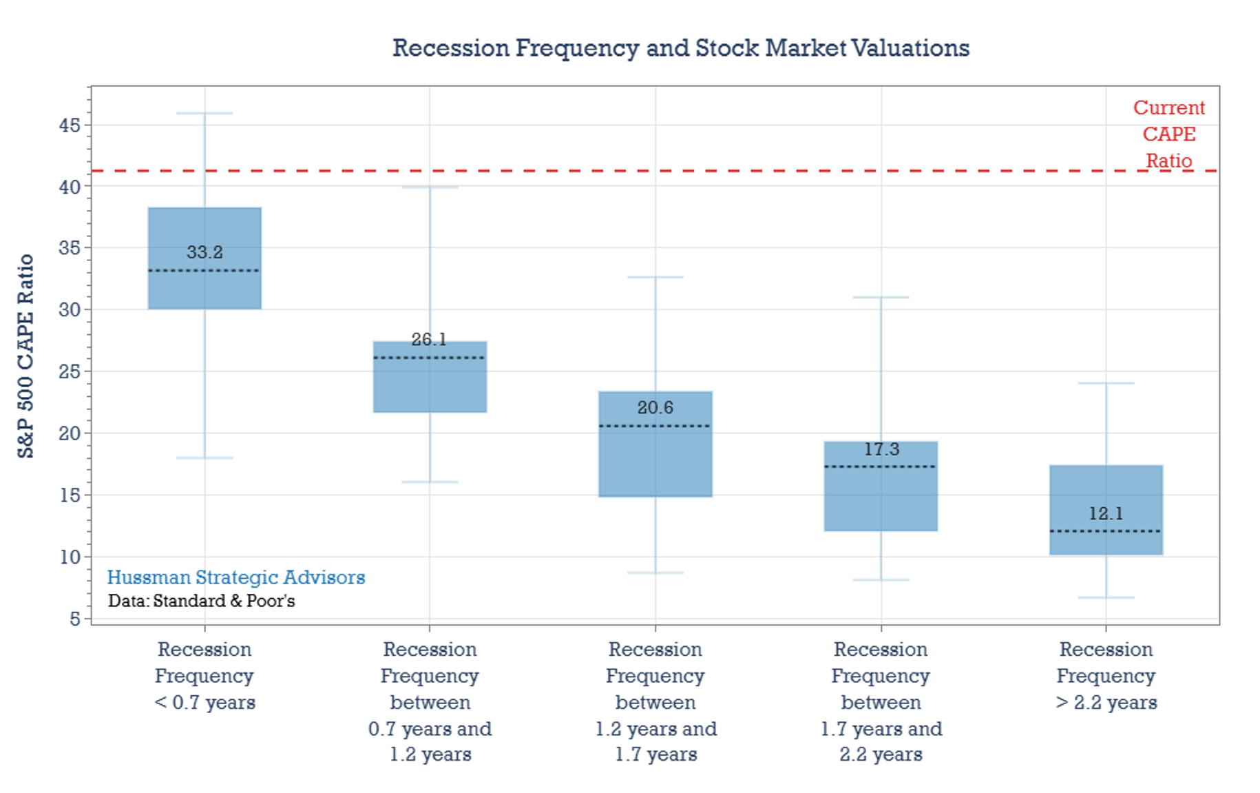
These outcomes aren’t independent of the results displayed in the inflation volatility chart above. Inflation and economic volatility often go hand in hand. The early stages of recessions have typically coincided with surges in both inflation and inflation volatility. Sharp inflation spikes, such as those in the early 1970’s and early 1980’s, slowed the economy, and once recessions took hold, collapsing demand often drove prices down, especially for energy.
Given this relationship, it’s not surprising that combining these indicators provides a useful gauge of overall macroeconomic volatility. In the chart below, I’ve simply averaged the quintiles from the Inflation Volatility and Recession Frequency charts. The pattern of macroeconomic volatility is clear: low-volatility periods have historically coincided with the highest stock market valuations, while the most volatile periods have typically been met with the lowest.
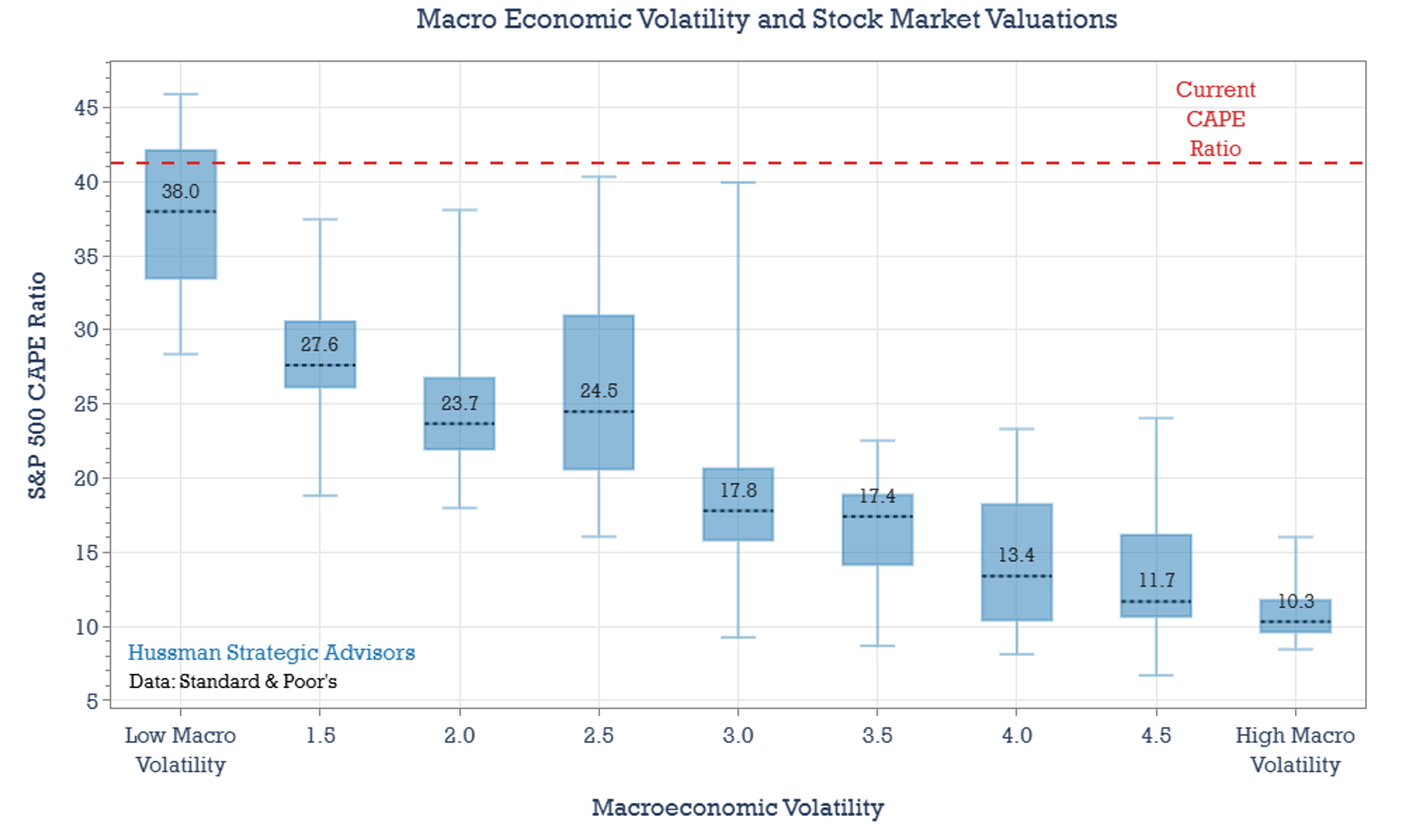
Again, it is important to interpret these valuation ranges correctly. Rather than concluding that various levels of macro volatility “justify” various levels of valuation, it’s more accurate to say that high macro volatility increases the discomfort of investors, leading investors to pay low valuations and to demand high future returns as compensation for their discomfort. Low macro volatility makes investors more comfortable, encouraging them to pay high valuations and to demand little in the way of future compensation for taking risk. Once investors are paying high valuations, poor long-term returns are baked in the cake. At that point, any increase in macro volatility causes those poor returns to be far more immediate. The reverse is true once investors have driven valuations to depressed levels.
The idea that a more volatile macroeconomic backdrop can lead to lower valuations has strong roots. Eugene Fama and Ken French explored this relationship in the late 1980s, finding that expected returns vary with macroeconomic conditions. Jeremy Grantham and Ben Inker of GMO have likewise developed a valuation framework that incorporates inflation, GDP growth, and corporate profitability.
Still, this perspective has received less attention in recent years, in part because the past couple of decades have been marked by generally declining inflation volatility and relatively infrequent recessions, at least by historical standards. If those trends were to shift in a more persistent way – and a loss of central bank independence should be viewed as a potential catalyst – these macroeconomic/valuation relationships would likely regain prominence.
Current readings of macroeconomic volatility are low. Over the past year, 12-month changes in core inflation have fluctuated by roughly 23 basis points. Economist forecasts for inflation suggest that the volatility of the price level may remain low. Moreover, aside from the brief COVID recession, the past decade has been recession-free. But markets are always forward-looking.
Is recession risk low today? According to Wall Street economists, the odds of recession are moderate to low. They currently assign roughly a 30% probability that a recession begins sometime over the next year – close to the long-run average since 2008.
Even so, it likely makes sense to remain on alert — not fully expecting a recession, but also not assigning it the typical mid-cycle odds. That caution reflects the emergence of data points rarely observed outside of recessions. Construction and manufacturing payrolls now show flat or negative six-month changes, a combination rarely seen outside of recessions. In addition, the ratio of workers employed part time for economic reasons relative to those working part time for non-economic reasons has risen at a pace rarely seen outside of recessions, based on its three-month average relative to its 12-month low. Together these indicators point to growing strains beneath the surface of the labor market.
Manufacturing surveys also remain weak. The PMI headline index, along with its New Orders and Employment components, are all currently below 48, a set of levels generally observed in periods just preceding or during recessions. Still, none of these indicators alone is sufficient to confidently forecast a downturn. More convincing evidence would include broader economic weakness and six-month stock market returns near zero or negative. Based on the data currently in hand, however, recession risk may be higher than economists and markets are presently pricing in.
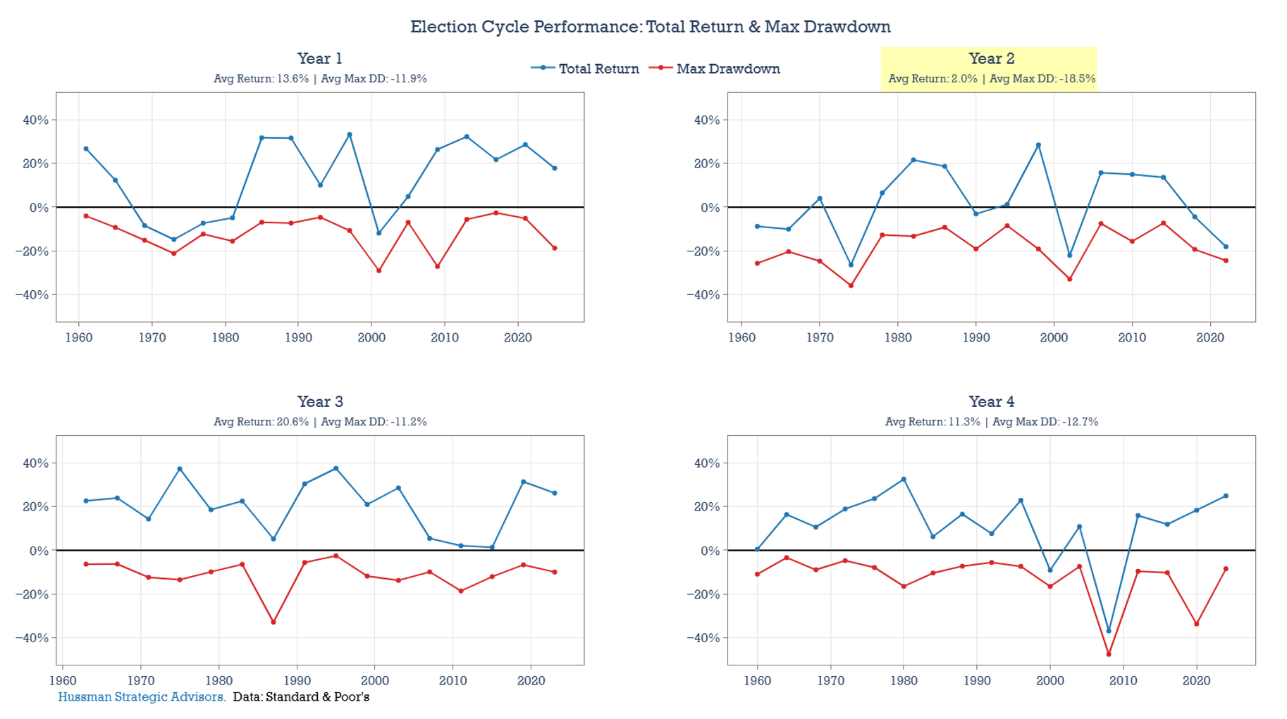
There is also an election-cycle quirk worth noting. Since 1950, U.S. recessions have tended to occur disproportionately during the latter part of year 1 and year 2 of the presidential election cycle – which is the window we are in now. The majority of post-1950 recessions – including those that occurred in 1953, 1957, 1969, 1973, 1981, 1990, and 2001 – took place during years 1 and 2 of the election cycle.
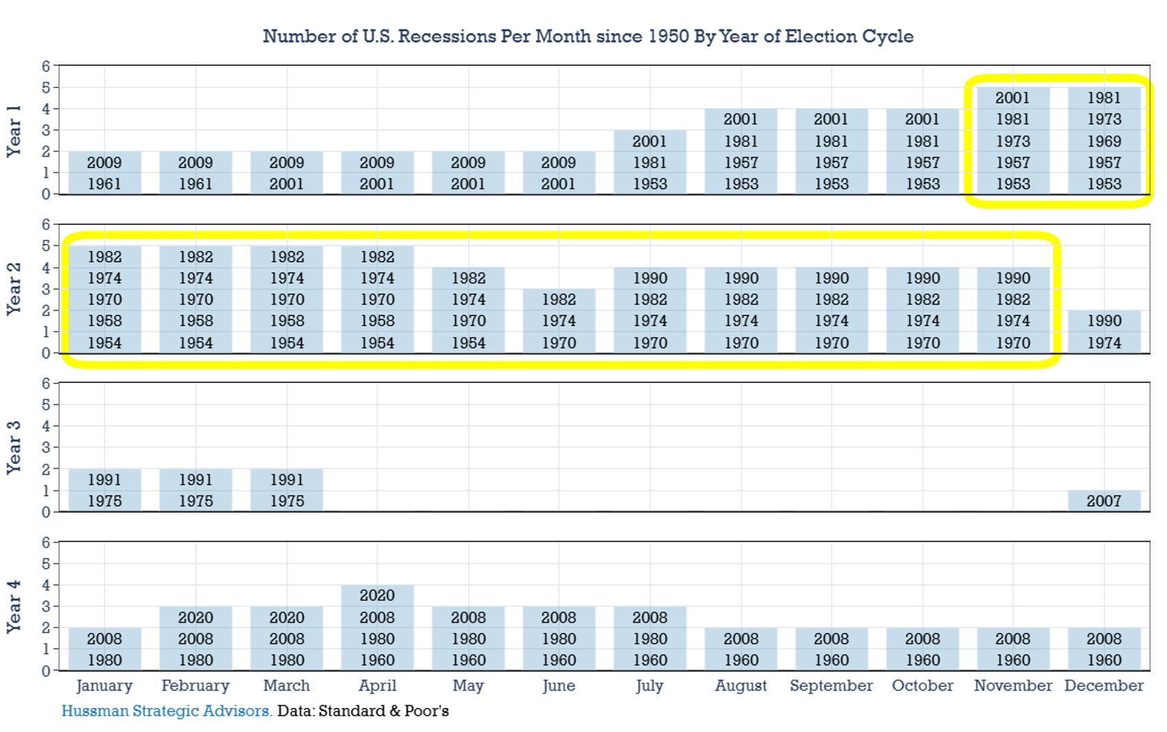
This elevated, calendar-based recession risk helps explain why average annualized returns in year 3 of the presidential cycle have historically been so strong. It isn’t magic. Rather, it largely reflects the fact that there have been very few recessions during year 3, and those that did occur were either nearing their end (in 1975 and 1991) or had only just begun (in 2007). That scarcity of recessions in year 3 – combined with the tendency for year 2 to experience late-year market declines – has mechanically boosted average returns in the third year of a presidential term. If that favorable pattern were to break, the year-3 record of consistently positive returns would likely weaken as well.
The charts below show calendar-year returns and maximum drawdowns for each year since 1950, grouped by presidential election-cycle year. Year 2 has the lowest average returns and average largest drawdown of the four years, historically.
Macroeconomic Volatility and Expected Returns
When discussing factors that may influence the level of stock market valuations, it’s important not to confuse explanation with justification. Even if certain conditions help explain why valuations are high, they don’t necessarily justify those valuations – nor do they alter the typical outcome: lower future returns. The chart below shows the S&P 500 Index’s forward 10-year returns by ranges of starting level of macroeconomic volatility. Since these ranges also align well with valuation groupings, it’s not surprising they correlate with future performance. High volatility periods have tended to precede above-average returns, while low-volatility periods have often been followed by below-average returns — including, at times, annualized losses over the next decade.
The relationship between stock market valuations, macroeconomic volatility, and subsequent returns is an important one. Valuations remain one of the most useful tools for estimating long-term forward returns, but they are not infallible. Markets often overshoot – both at the peak of bubbles and at the depths of declines – causing market returns to differ from what one would historically expect on the basis of valuations, particularly over the short run.
Another reason for the mismatch lies in the variation of the macroeconomic backdrop. Once valuations are steeply overvalued, for example, an increase in macro volatility over the following decade can drive returns even lower than what historical relationships would suggest. Conversely, if the macro environment remains stable or improves, returns are still typically below average, but often better than expected.
The combination of expensive markets coupled with a deteriorating macroeconomic backdrop has historically been the most damaging setup for long-term equity returns.
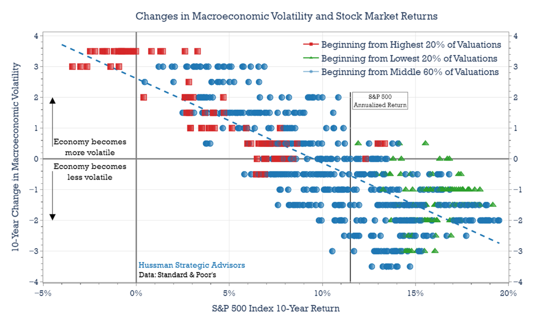
This dynamic is illustrated in the chart below. The horizontal axis shows 10-year S&P 500 Index returns, while the vertical axis represents changes in macroeconomic volatility over the same periods. Values below zero indicate declining volatility – such as the 1980’s, which began with one of the most volatile environments and moved toward greater stability. Values above zero reflect periods of increasing volatility – for example, the 2000’s, which experienced two recessions and a period of deflation after a relatively calm prior era.
The colors and shapes in the chart correspond to starting valuation levels based on the CAPE Ratio. Red squares indicate the top 20% of historical valuations – the most expensive markets. Green triangles represent the bottom 20% – the cheapest starting points. Blue circles fall in the middle 60%, reflecting more neutral valuation levels.
The red squares highlight two key patterns. First, markets that start from high valuation levels tend to produce below-average returns. While the average 10-year return over the full period was about 11.5% annually, most of the red markers fall short of that benchmark. Second, the worst outcomes, including low single-digit or even negative returns, typically occur when high valuations are followed by rising macroeconomic volatility. This may involve more frequent recessions, greater inflation instability, or both. The combination of expensive markets coupled with a deteriorating macroeconomic backdrop has historically been the most damaging setup for long-term equity returns.
Now consider the green triangles, which represent periods beginning with low valuations. Here, the patterns reverse: low starting valuations generally lead to above-average returns, and when accompanied by declining volatility, those returns are often particularly strong.
Current record-high stock market valuations rest partly on the assumption that inflation volatility and recession risk will remain low. Historically, periods of stable inflation and infrequent recessions have supported elevated valuations, while rising inflation uncertainty and repeated downturns have led to meaningful valuation compression.
Today’s valuations appear to price in a return to the pre-pandemic regime of unusually low macroeconomic volatility. If that outlook shifts – whether through rising inflation volatility, potentially stemming from diminished Federal Reserve independence, or an increase in recession risk – history suggests that equity valuations, and long-term returns, may be vulnerable to meaningful downside.
Keep Me Informed
Please enter your email address to be notified of new content, including market commentary and special updates.
Thank you for your interest in the Hussman Funds.
100% Spam-free. No list sharing. No solicitations. Opt-out anytime with one click.
By submitting this form, you consent to receive news and commentary, at no cost, from Hussman Strategic Advisors, News & Commentary, Cincinnati OH, 45246. https://www.hussmanfunds.com. You can revoke your consent to receive emails at any time by clicking the unsubscribe link at the bottom of every email. Emails are serviced by Constant Contact.
Prospectuses for the Hussman Strategic Market Cycle Fund, the Hussman Strategic Total Return Fund, and the Hussman Strategic Allocation Fund, as well as Fund reports and other information, are available by clicking Prospectus & Reports under “The Funds” menu button on any page of this website.
The S&P 500 Index is a commonly recognized, capitalization-weighted index of 500 widely-held equity securities, designed to measure broad U.S. equity performance. The Bloomberg U.S. Aggregate Bond Index is made up of the Bloomberg U.S. Government/Corporate Bond Index, Mortgage-Backed Securities Index, and Asset-Backed Securities Index, including securities that are of investment grade quality or better, have at least one year to maturity, and have an outstanding par value of at least $100 million. The Bloomberg US EQ:FI 60:40 Index is designed to measure cross-asset market performance in the U.S. The index rebalances monthly to 60% equities and 40% fixed income. The equity and fixed income allocation is represented by Bloomberg U.S. Large Cap Index and Bloomberg U.S. Aggregate Index. You cannot invest directly in an index.
Estimates of prospective return and risk for equities, bonds, and other financial markets are forward-looking statements based the analysis and reasonable beliefs of Hussman Strategic Advisors. They are not a guarantee of future performance, and are not indicative of the prospective returns of any of the Hussman Funds. Actual returns may differ substantially from the estimates provided. Estimates of prospective long-term returns for the S&P 500 reflect our standard valuation methodology, focusing on the relationship between current market prices and earnings, dividends and other fundamentals, adjusted for variability over the economic cycle. Further details relating to MarketCap/GVA (the ratio of nonfinancial market capitalization to gross-value added, including estimated foreign revenues) and our Margin-Adjusted P/E (MAPE) can be found in the Market Comment Archive under the Knowledge Center tab of this website. MarketCap/GVA: Hussman 05/18/15. MAPE: Hussman 05/05/14, Hussman 09/04/17.