Photo-Illustration: Curbed; Photos: Metropolitan Transit Authority
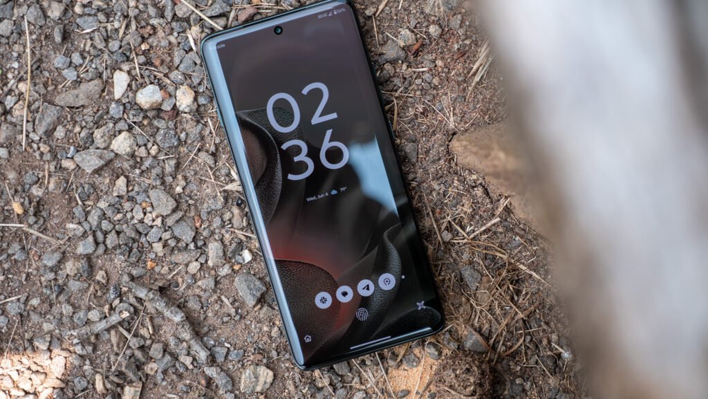
By this afternoon, the main MTA app on your phone will likely have updated, and not a moment too soon. Launched in 2024 and built by an outside contractor, the old app — and I refer here to the principal one, simply called MTA, that’s used for way finding and travel planning — was not a disaster, but it left a lot to be desired. (It’s separate from TrainTime, the LIRR and Metro-North ticketing app, which is much better.) It was pretty good for navigating the subways, passable for users of commuter rail, and less good at anything involving buses. On my phone, at least, it would frequently hang up, showing a blank screen for minutes at a time, failing to refresh while I stood there at a wintry bus stop stamping my feet from both the cold and frustration. I could go on about its various merits and shortcomings, but this guy has done the work for me.
Shortly before today’s push, I sat down with Shanifah Rieara, the MTA’s chief customer officer, for a first look at its replacement, and I offered her a version of those observations about the old app. “Your assessment is accurate,” she said with a slightly rueful nod, whereupon she and her team opened the new one that will be pushed out this morning. They’re proud of it, and Rieara explained that its predecessors were catch-up attempts that displayed some of the haste of their development. “We were so far behind,” she admits, “and it was embarrassing.”
My first impression is, simply at a visual level, it looks sharp. It incorporates the colors and symbols pioneered by the so-called Vignelli diagram — Unimark’s 1972 subway map, a graphic-design landmark, beloved and hated, discarded then updated and reintroduced, its merits debated for decades. It’s pretty clearly part of a larger MTA strategy to unify its systemwide graphics around the Unimark approach. Somewhere, Harry Beck is smiling.
When you launch the app, the location dot defaults to your current position. When you drag it to any spot on the map, the stops and routes are immediately updated to display the closest ones first.

Photo: MTA
A few years ago, an app called the Live Map took the first stab at this look, and it was a real step up graphically and functionally. It had, however, been delivered to the MTA by an outside design firm called Work & Co., and it failed to sustain enough internal MTA support, either technological or spiritual, to survive in the long term. Updates lagged, and it soon degraded from pretty good to not so good. It was quietly taken down about a year ago.
The new digital product, by contrast, was built in-house at the MTA. That choice could have brought its own pitfalls. Transit people, in my experience, use a somewhat different language from civilians when they talk about stations and routes, and besides, an agency that knows how to run buses and resurface bridge decks does not necessarily know what makes for a friendly piece of public-facing software. In this case, at least, their deep knowledge delivered real clarity onscreen. Rieara, with a little laugh, says to me that the previous apps, designed by companies without New York roots, “aren’t in tune to the peculiarities of — the wonderful idiosyncrasies of — the subway.” One stumbling block was data volume: Although most stations are now wired so mobile phones can be used underground, the signal is often much weaker and the data throughput slower than above. The tech people who build most maps — let’s say, the ones who operate mostly from Cupertino and Mountain View — think hard about the nuances of getting you through a complex cloverleaf exit, but the concept that you might be in a 120-year-old tunnel for an hour, with a moment of connectivity every few minutes as you pass through a station, is not necessarily top of mind for them. This app, by contrast, is built to function in what the team refers to as a low-data environment, and it is much, much faster than its predecessor. I have run the beta version during my past few commutes, and it snapped to attention in all but the weakest of reception areas.
Rieara also emphasizes that the developers on this project actually ride the transit system — though they made a point of testing it with a lot of outsiders besides their own staff, partly to make sure it handled, for example, a wide array of commutes that did not lead to Bowling Green or Whitehall Street (the two stops directly in front of the agency’s headquarters at 2 Broadway).
When you zoom in on a given subway station, you now see its floor plan, lightly shaded, beneath the street. Go in close enough, and boxes indicate every entrance stairway and elevator. When you are at a gangly mash-up of a station like Canal Street on the 6, J, or N/R/Q/W lines, it’s really useful to see how far it is from one exit to another.

Photo: MTA
When you tap the wheelchair icon, inaccessible stations — of which there are still too many in the system, though that’s finally beginning to change — disappear from the map. There’s also a differentiation between stations that are fully versus partially accessible (say, one platform has an elevator but another doesn’t). A clickable option at the bottom of each station listing displays the status of elevators (working or not) with an estimated time till the busted ones are running again. There is also a chat function through which users can, after a couple of robot prompts to narrow down the conversation, report a problem to an actual MTA human being.
When you click down to a particular line, you see the arriving trains stacked up …

Photo: MTA
… and when you tap on an individual train, you see a schematic of its (usually) eight or ten cars. There are arrows telling you where you might want to board so you can step out right in front of an exit or to transfer.

Photo: MTA
I’m not sure how many people will drill down this far and actually use a feature like that (though there are plenty who already plan their trips this way by guesswork), but if you want to, it is a splendid little piece of detail. There’s quite a bit of focus on easing you through transfers, in fact; you’ll see lines that share a platform grouped in little ovals, for example.
Anyway, what about those buses, the thornier portion of the old app? I dropped a dot by La Guardia Airport, infamously inaccessible by subway, and here’s the set of options.

Photo: MTA
And when you click on, let’s say, the M60, the arriving buses are listed …

Photo: MTA
… and if you tap any one of those, you see how far off it is.

Photo: MTA
An inevitable problem with bus navigation is not the app but the relatively uncontrolled environment of the street itself. If the app says a bus is five minutes away and then some doofus double-parks in front of it, those five minutes can abruptly become ten or 15, and you’ll still be left, chilly and stomping, at the bus stop. There’s only so much the tech team can do there. But they tell me there has been, in the past year or so, a big push to clean up the information behind the app, and that too has contributed to the snappiness of this front-end presentation of the data. It will likely never be 100 percent reliable as long as we have relatively few dedicated bus lanes with hard curbs.
A couple of things are pretty obviously missing from the new app. One is full integration with Metro-North and the LIRR. Rieara tells me those networks will continue to use TrainTime, introduced in 2022, at least for now. Its trip-planning aspects overlap somewhat with those of this new main MTA app, but TrainTime is largely geared toward buying and redeeming tickets and will continue to be so for a while. The other thing missing is the ability to refill your OMNY card or account and check your balance — functions, Rieara says, that will likely be added within the year.
I’ll admit, as I wrote this, that I wondered if these first very positive impressions of the app were glib — that I would see the product’s weaknesses after I spent a couple of months riding with it. But it turns out that work has been done by the hard-core members of Reddit’s often thoughtful, semi-earnest, semi-cranky r/nycrail forum, who spend a significant portion of their days discussing stuff like interlockings. App testing is a situation where the voices of the many outweigh those of the few or the one because a wide array of users will hammer the thing in different ways to reveal its breaking points. As it happens, quite a few of the beta testers post in that forum. So far, the Reddit hive mind is as impressed as I am. The only real suggestion in that thread is pretty wonky: “We need car numbers next,” one Redditor proposes, looking to report (or avoid) a hot car come August.